Dept. of Energy
- Concept
- Web Design
- UX Research
Overview
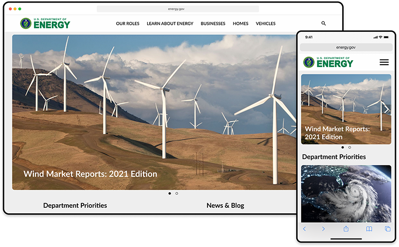
This case study focuses on the evaluation and redesign of an existing government website. As the sole designer on the project, my responsibility encompassed all aspects of the process, including research, design, and testing.
Tools
- Figma
- Miro
Roles
- Researcher
- UX Designer
- UI Designer
The Challenge
The website suffered from various user experience problems, hindering users from finding relevant information about renewable energy, energy cost reduction, and the government's climate crisis initiatives. The initial attempts at using the website were confusing for users, indicating a need for improvement.
User Research
The first thing I did in this project was attempt to gain an understanding of who might use this website, how they would use it and what difficulties they may encounter. To accomplish this, I conducted a series of interviews with potential users, asking them to identify what they would like to do or find on this site and observing them attempt fulfill their goals. I then used the resulting insights to synthesize the following user persona.
User Persona

Thomas Patterson
"I want to know what the government is doing to address the climate crisis and what role I can play."
Background
Thomas is a 30-year-old software developer living in Atlanta. He is a new homeowner and spends some of his free time researching ways to improve his home and save money on bills.
Goals
- Learn about renewable energy
- Lower his energy costs
- Read about the government's recent efforts to combat the climate crisis
Pains
- Doesn't know where to start his search for information
- Finds the website confusing
With these insights in mind, I mapped out the steps it would take the user to find information on an energy saving guide and information on alternative fuels. The resulting flow includes navigating 6 pages, sometimes via hyperlinks buried in the page, with three different primary navigation bars. At this point, the primary problem that I needed to solve for the user became clear.
The Problem
Energy and climate-conscious consumers need a convenient source of information to help them reduce their energy costs and impact on the climate. However, this information is not easily obtained from the current Energy Department's website.
My Hypothesis
If the current website was reorganized to make the information that users are looking for more easily and intuitively accessible, they would be able to save money and reduce their energy consumption.
Concept Development
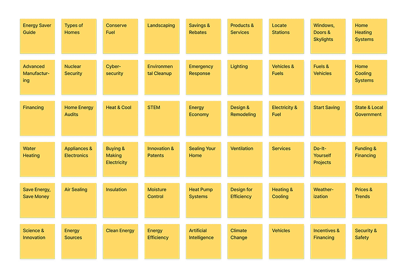
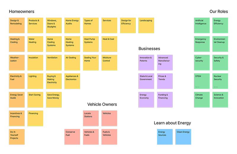
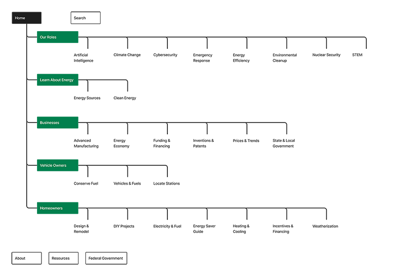
To explore new ways of presenting the site's navigation, I created a randomized library with all the site's navigation items in sticky notes. Next, I resorted them into five categories and created a new sitemap with these categories as the primary navigation.
Sitemap Research
Iterative Design
Once I had settled on the new information architecture for the site, I began creating a low-fidelity prototype in Figma. The redesigned homepage featured a rotating hero image highlighting important articles, alongside two columns of cards. One column displayed static articles related to department priorities, while the other column provided updated news and blog posts. A secondary navigation bar accompanied each primary navigation item. I also created a mobile-responsive version of the site to accommodate different devices.
Lo-Fi Protoype
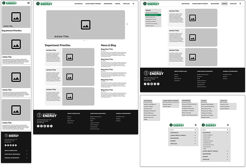
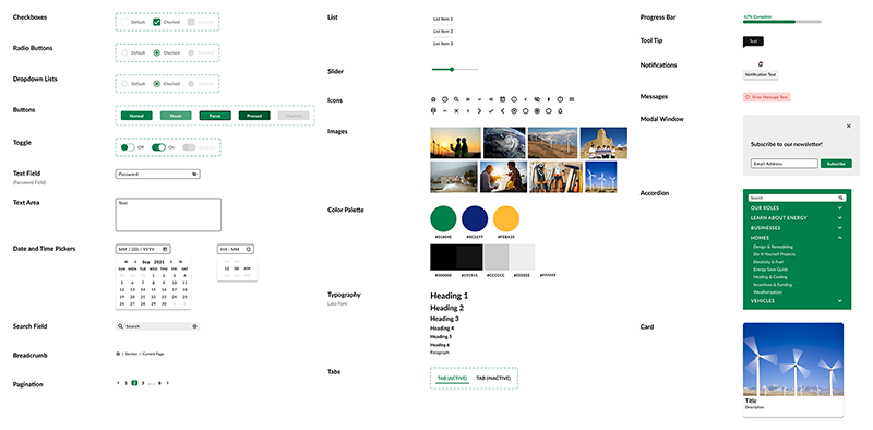
Usability testing of the low-fidelity prototype yielded positive feedback. Users found the navigation and layout of the homepage intuitive, providing them with a clear understanding of available content. The next step involved developing a style guide and transitioning the low-fidelity prototype into a high-fidelity version. The color palette retained the agency's main colors while incorporating green as the primary color to align with the agency's clean and green energy focus.
Style Guide
Results & Impact
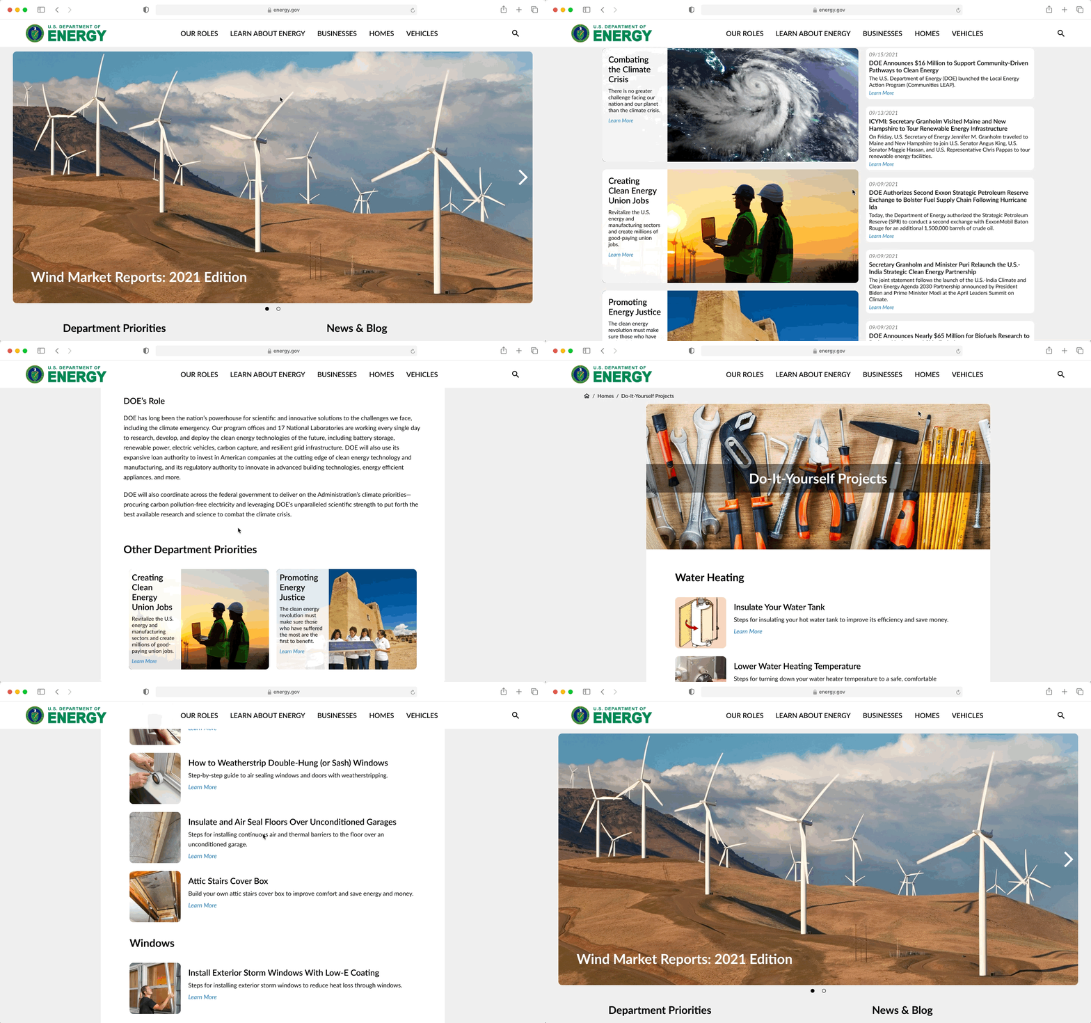
The outcome of this project, according to my testing, is that users are now able to better understand what this website can be used for, what the department is currently prioritizing and working on, and how they can easily find the information they are looking for when visiting this site.
Final Prototype
Lessons Learned
Throughout the process, I realized the importance of conducting thorough user research to uncover pain points and inform the redesign. Iterative prototyping and usability testing allowed for continuous improvement based on user feedback. Retaining some aspects of the existing branding helped maintain familiarity while introducing enhancements.
Conclusion
By addressing the website's UX problems through an improved information architecture, intuitive navigation, and responsive design, users can now easily access valuable information on renewable energy, energy savings, and government initiatives. This redesign enhances the user experience and empowers energy and climate-conscious individuals to make informed decisions, leading to cost savings and reduced environmental impact.