Our House
- Concept
- Web Design
- UX Research
Overview
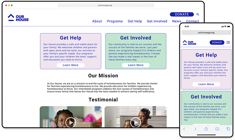
Our House is a non-profit organization that provides assistance to families experiencing homelessnes and volunteering opportunities to anyone wishing to help. This case study focuses on the project's goal of evaluating the user experience of the existing website and redesigning it to address any deficiencies. As a UX Designer, my role was instrumental in the creation of a new user flow and maintenance of prototypes within Figma.
Tools
- Figma
- Miro
Contributors
- Marissa Patterson
- Leslie Wong
- Lynn Faiola
The Challenge
The challenge was to enhance the user experience of the Our House website by identifying and addressing usability issues. The project aimed to create a more streamlined design and improve navigation to increase website traffic, donations, and volunteer numbers.
User Research
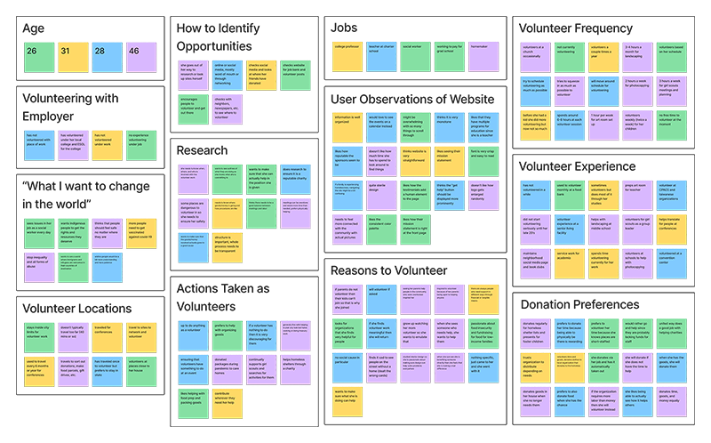
To gain insights into our target users, we conducted interviews with potential users to understand their volunteering habits, barriers to volunteering more, and factors influencing their cause selection. We collected the findings and organized them into an affinity diagram, which revealed common themes. From this research, we created a persona named Jane Voorhees and developed a storyboard to empathize with her experience.
Affinity Diagram
User Persona

"Finding time to volunteer can be difficult, so I want to make sure I volunteer at a place I truly support."
Background
Jane is a retail manager and has an inconsistent work schedule, but they love to use their free time volunteering. They try to help a variety of non-profits, but like to do their research first so they feel confident they're helping a group aligned with their ideology. Jane prefers volunteering with small, local non-profits that don't necessarily have a lot of exposure.
Goals
- Find volunteer opportunities that align with their personal ideology
- Want to feel like they're making a difference and actually see the impact in person
- Meet like-minded people who share similar views on social causes
Pains
- Doesn't know where to find out what skills are needed
- Hard to find time to volunteer
- Difficult and time-consuming to find a reputable charity/non-profit
Based on our research, we formulated the following problem statement and hypothesis:
The Problem
Jane is eager to make a meaningful impact on their community, but doesn't know how their skills can best be utilized or what opportunities would be possible with their schedule.
Our Hypothesis
We believe that redesigning Our House's website to have a more streamlined design and updated navigation will help increase website traffic, as well as donation and volunteer numbers.
Concept Development
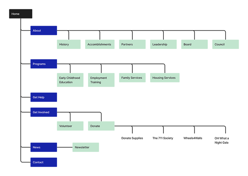
Based on our research and user insights, we designed a sitemap with seven primary navigation categories that we believed would be most useful for Jane. These categories included About, Programs, Get Help, Get Involved, News, and Contact. We aimed to streamline the design and update the navigation to improve user engagement.
Sitemap
Sketches
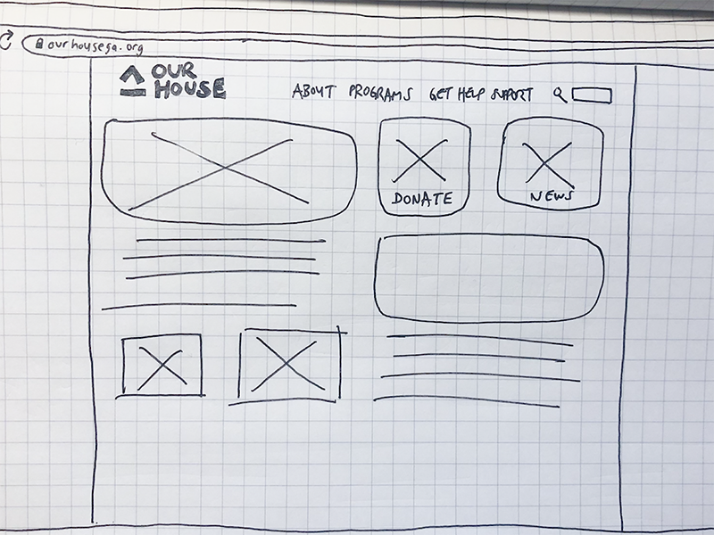
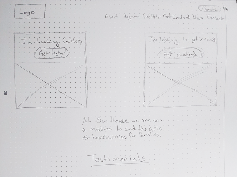
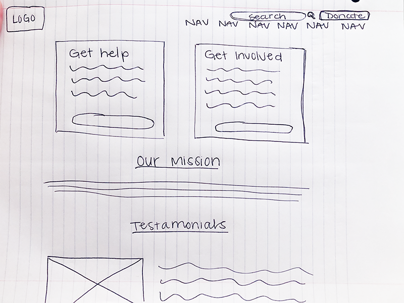
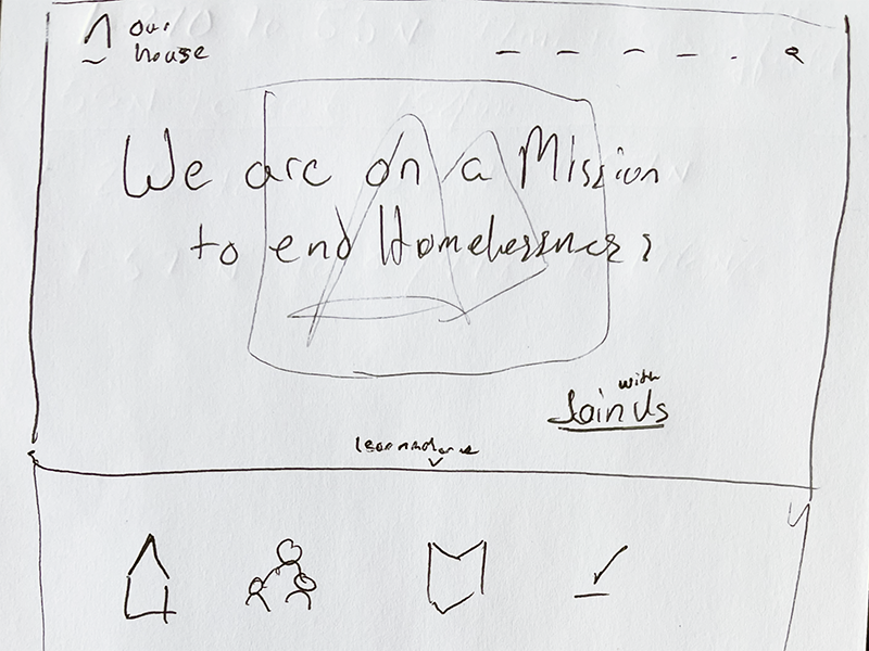
Next, we each started to ideate with some sketches, and after team discussions, we finalized the home page layout with two cards for getting involved and getting help, along with the organization's mission statement, which we believe will enable users to immediately find what they are looking for.
Iterative Design
Using the sketches, I then created a low-fidelity prototype of the home page and several other key pages. We also considered the mobile experience, ensuring consistency with the desktop design while adapting elements to fit smaller screens. Usability testing was conducted with volunteers to identify any issues or usability concerns before proceeding to the final design.
Lo-Fi Prototypes
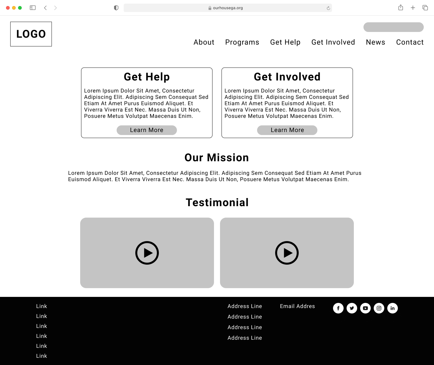
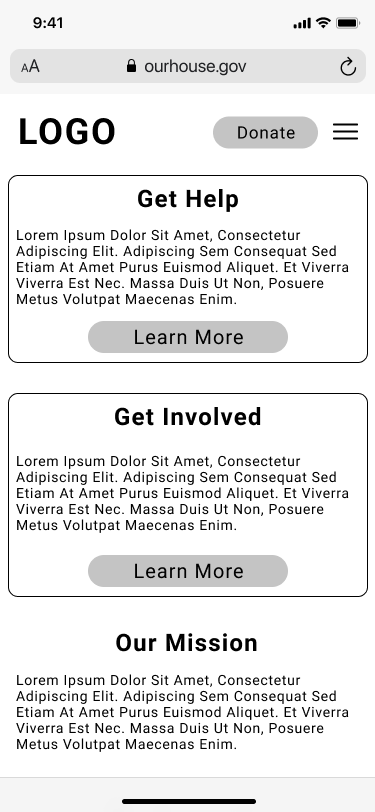
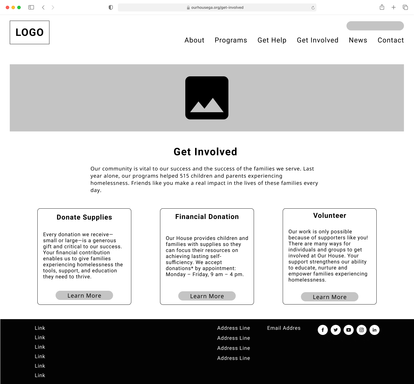
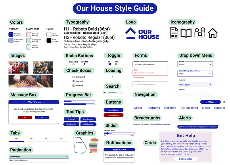
The feedback from usability testing was positive, indicating that users could effectively navigate the site and accomplish their tasks. With the prototype's functionality confirmed, we developed a style guide for the high-fidelity design.
Style Guide
Design Improvements
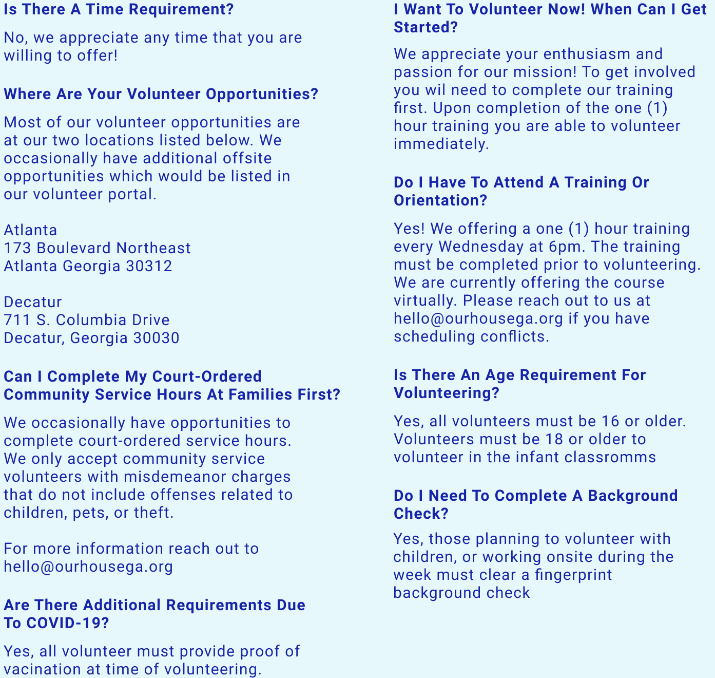
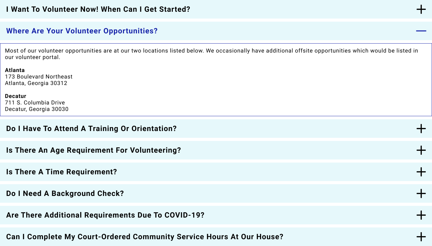
Some design elements were retained from the original website, while others were modified for cohesiveness and improved understanding. We made design enhancements based on user feedback, such as adding a drop-shadow below the navigation bar to create a clear visual distinction between the navigation and content sections. We also adjusted the FAQ section to progressively disclose answers to questions through an accordion menu.


Results & Impact
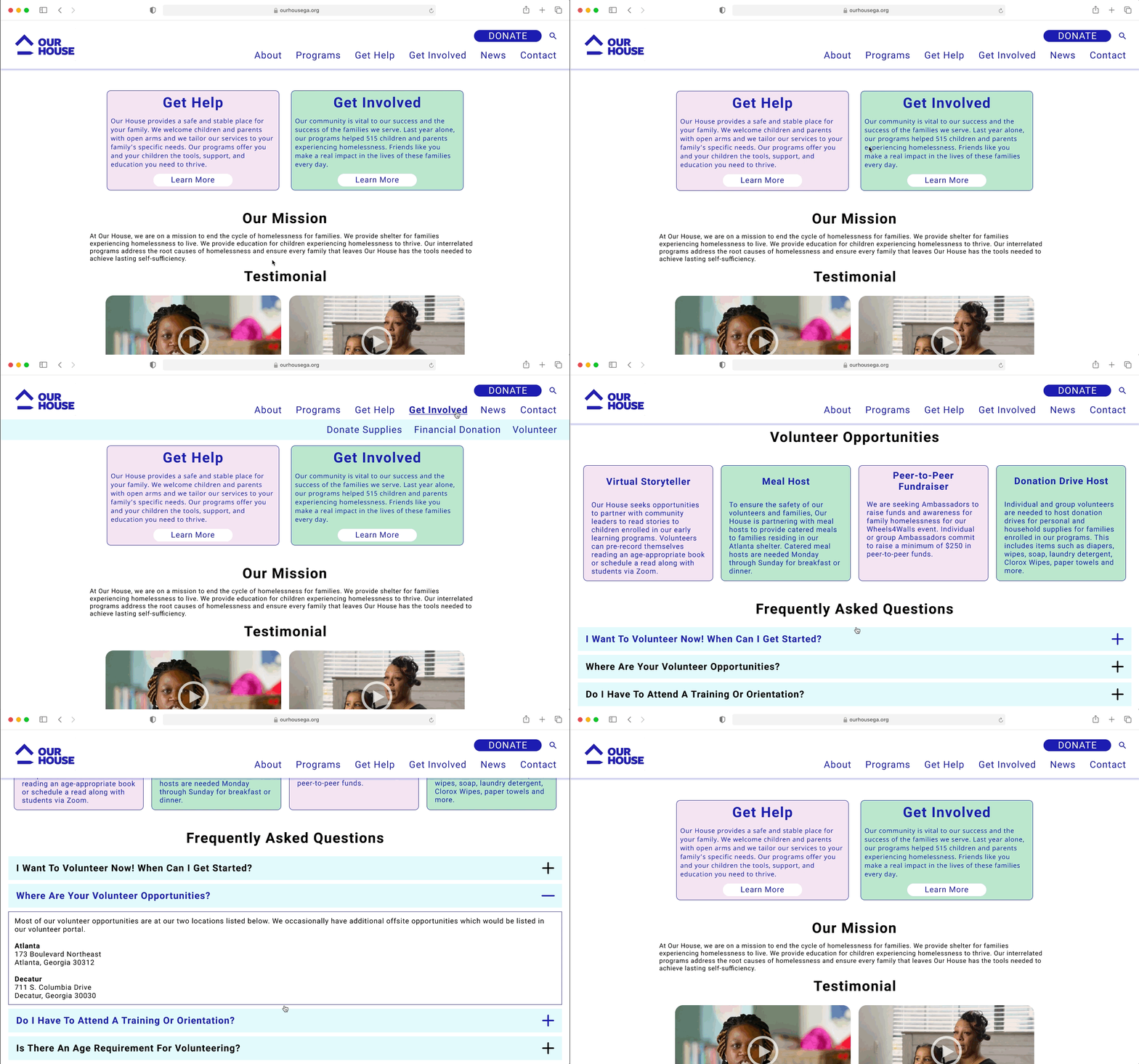
The final design solution was a high-fidelity prototype and website that enabled users to quickly and easily find the information they were looking for and get involved in their community. Positive feedback received during usability testing validated our design decisions, indicating that our redesign of Our House's website would make a positive impact.
Final Prototype
Lessons Learned
Throughout the project, we learned the importance of user research in understanding the needs and pain points of the target audience. Iterative design and usability testing were crucial in refining the prototype and addressing user concerns. Feedback from users during the A/B testing of the FAQ section informed our decision to adopt an accordion-style design, which was found to be more user-friendly.
Conclusion
Through this web redesign project, we successfully improved the user experience of Our House's website. The redesigned high-fidelity prototype showcased a streamlined design, updated navigation, and improved visual elements. The project demonstrated the effectiveness of user research, iterative design, and usability testing in creating a user-centered solution. By addressing the needs of users like Jane Voorhees, we aimed to increase website traffic, donations, and volunteer numbers, ultimately making a meaningful impact on the community.